UI design case study
Design a loyalty program app for small businesses
The problem
This application is intended as a loyalty program for different shops, facilitating the "buy X get 1 free" principle.
The app works through a QR code on its home page, destined to scan in at the shop when a purchase is made, which would add points to the customer's loyalty card for that shop.
A similar focus is used in the Café Nero application; the main difference is that Café Nero can only be used to collect points at their stores, while our app aims to be available for use at any small business partner, making a new loyalty card for each company.
My role
I acted as the UI designer, working closely with the leadership team of designers and supporting them through designing the app's interface and applying knowledge about color, fonts, and general appearance.
Pain points
• Small business owners don't have the resources to develop a loyalty app of their own.
• Customers have problems keeping track of many loyalty apps.
Design solutions
The app was designed to support the need for small businesses to own an app and relieve the burden of too many apps for the customer. Also, the app includes functions for the owner and the client.
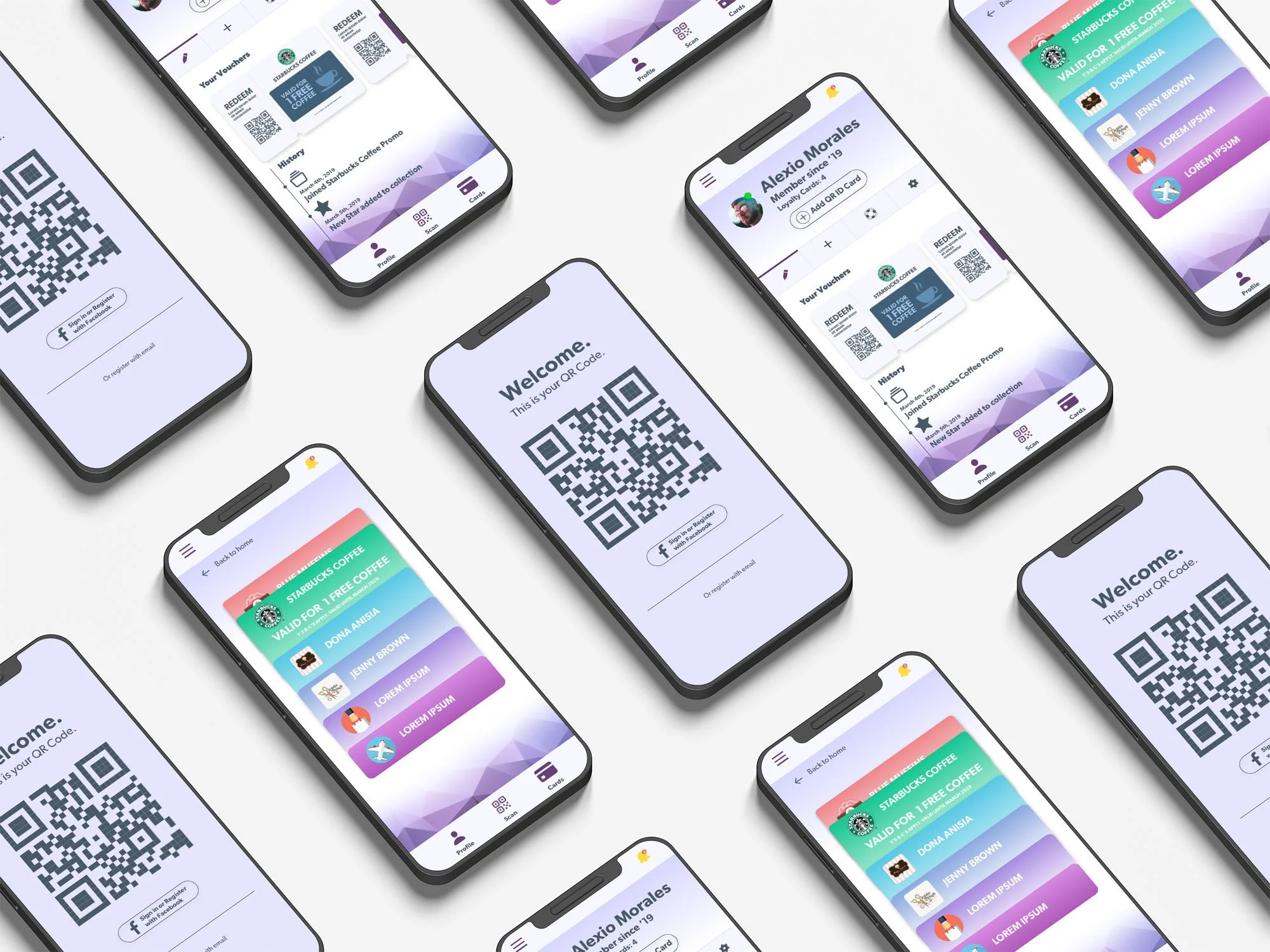
The application has four main screens, three of which are visible for users who are only customers. The business owners get to see the entirety of the interface.
The app will help people organize their rewards collected from different businesses into one application. It works with a QR code that can be scanned to add a new loyalty card or collect points. The same applies at the moment of redeeming the points.
Since the app lacks a branding identity, a pastel color palette was chosen, making it easy on the eyes. Imagery is limited to logos and icons to communicate complex ideas.

Getting started
The application is ready for use immediately upon download, meaning it can collect points without registering. However, the user still needs to create an account to be able to collect more points and add loyalty cards. The QR code is auto-generated when the app is first initiated.
Adding temporary loyalty cards
It can happen that a customer cannot install the app in the shop because he doesn't have internet access at that moment. To mitigate this type of happenings, they can be issued a paper card with a QR code to be used as a temporary loyalty card until they install the application. Upon installation, the user may add the points collected into their account.
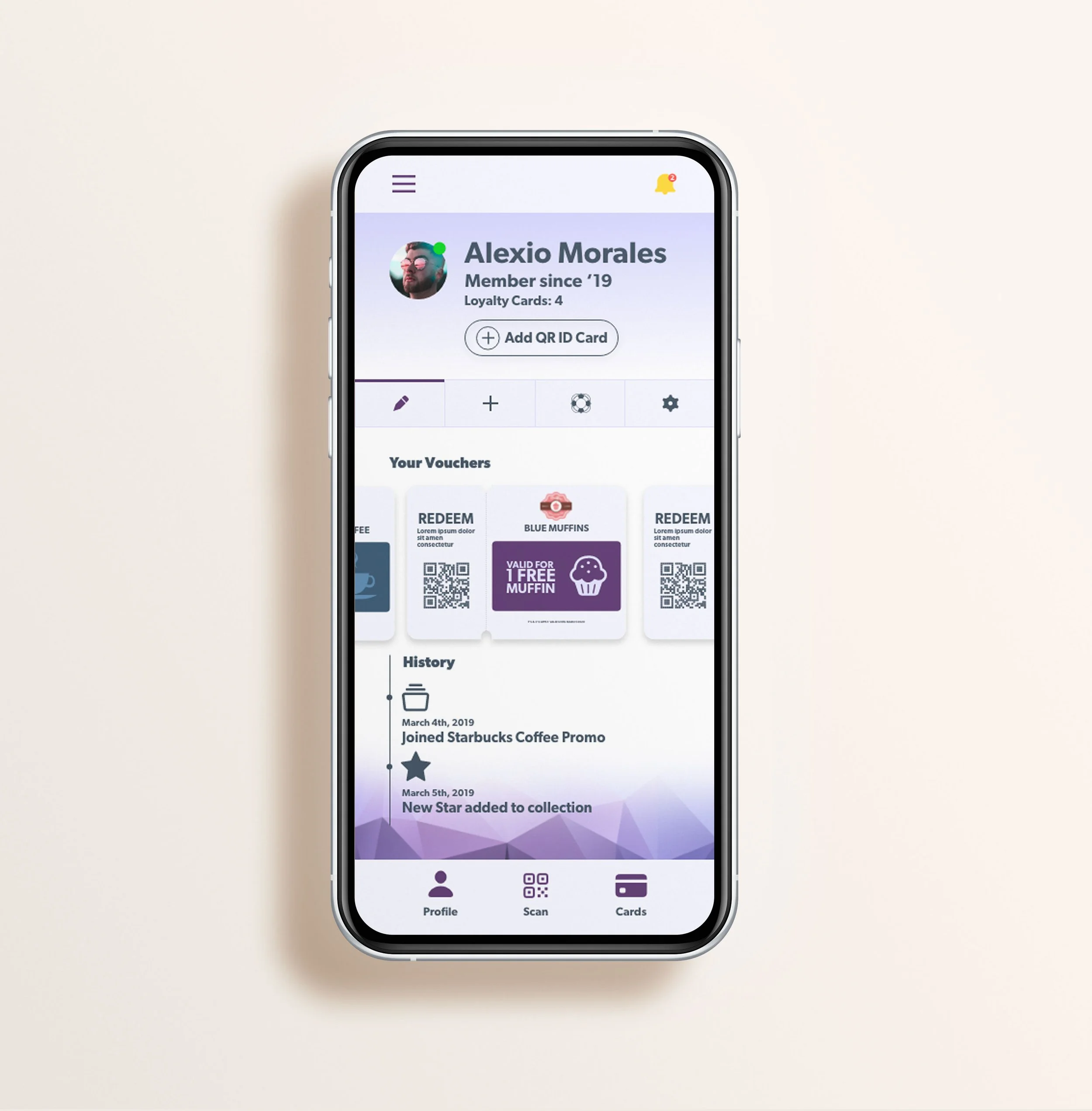
Once the customer has created an account, the profile page becomes visible. This is the first screen customers will see and the homepage from then on. From the home screen, it is possible to navigate to all the app areas, and it displays the active promotions.

The card can be shown to be scanned in the business and redeem their offer.

Multiple loyalty cards linked to the same user are scrolled through in a card stack view.

The original version vs. my new iteration
While doing my website migration and reviewing some of my past work, I came across this project from 2019. I decided to include it as my first UI project from scratch, but the errors were evident and showed that I was very inexperienced.
In the new iteration, I concerned myself with tap targets that were not big enough, which would cause many errors. There were issues with color, contrast and unnecessary steps that I removed or simplified to better the experience.
I look at this project with fondness, as it was my first app design, and I feel grateful for the growth I've taken as a designer and person in the last few years. I continue to love UI and UX design.
