CIS El Salvador is a non-profit organization based in San Salvador, El Salvador, empowering women and youth since 1993.
Its mission is to promote solidarity and human development for El Salvador's people.
I fell in love with their mission and worked with senior management, administrative staff, and volunteers for over a year to see the website completed.
Problem statement
The CIS's website was initially designed for the Joomla platform. On par with redesigning, CIS wanted an online shop to continue supporting the many artisans (mostly women from disadvantaged areas) collaborating with them. The website had a substantial user experience problem, primarily noticeable through the navigation and lacking flow and aesthetic appeal.
My role
I acted as the "user experience designer." I participated in all the design and development stages, from idea conception to backend implementation.
Pain points
The former website needed a refresher to adjust to current trends in usability. The main problems I detected were:
Confusing navigation
Not mobile-responsive
Lacking aesthetic appeal
Lacking design guidelines
Content is difficult to find
Contact options are not centralized
Lack of contrast and visual hierarchy
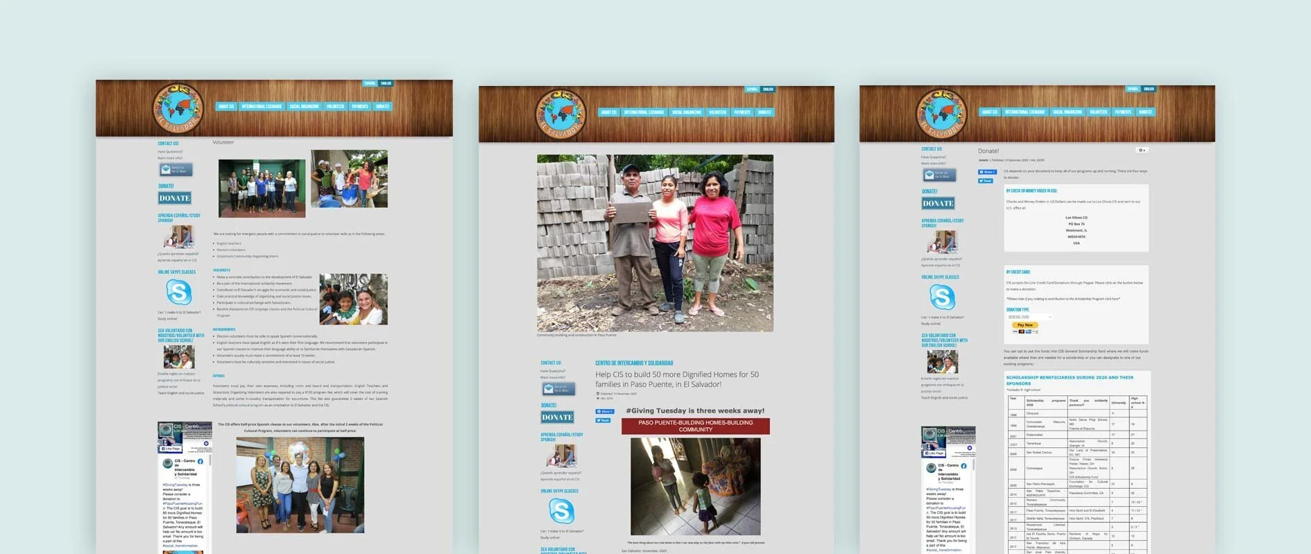
Above are three pages from the old website: homepage, news, and payments. All the pages have the same structure (a left sidebar and content to the right). The sidebar was eliminated from the get-go since it won't fit well with most mobile sizes.
It seems to me that the intention of the website was to have the structure of a blog. The homepage lacks any type of headings, and it looks like a segment of the news page. The news page has an attempt at a hero image but only contributes to making the distribution of information more confusing. The payment page is straightforward by showing the relevant information at the very top, but it becomes wordy when the user needs to dig deeper into the programs and offerings.
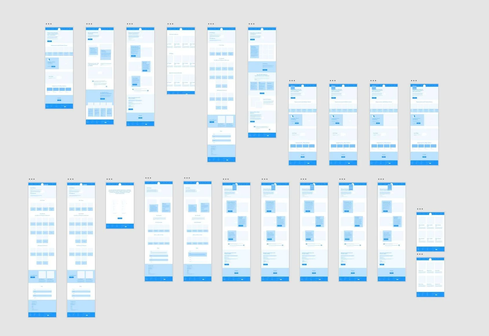
I started by exploring better ways to display the information and to help the user navigate the website easily since they have lots of information.
The website was built using Squarespace with customizations to ensure the CIS' main goals were achieved:
To have an online shop
To have a bilingual website
To improve data visualization
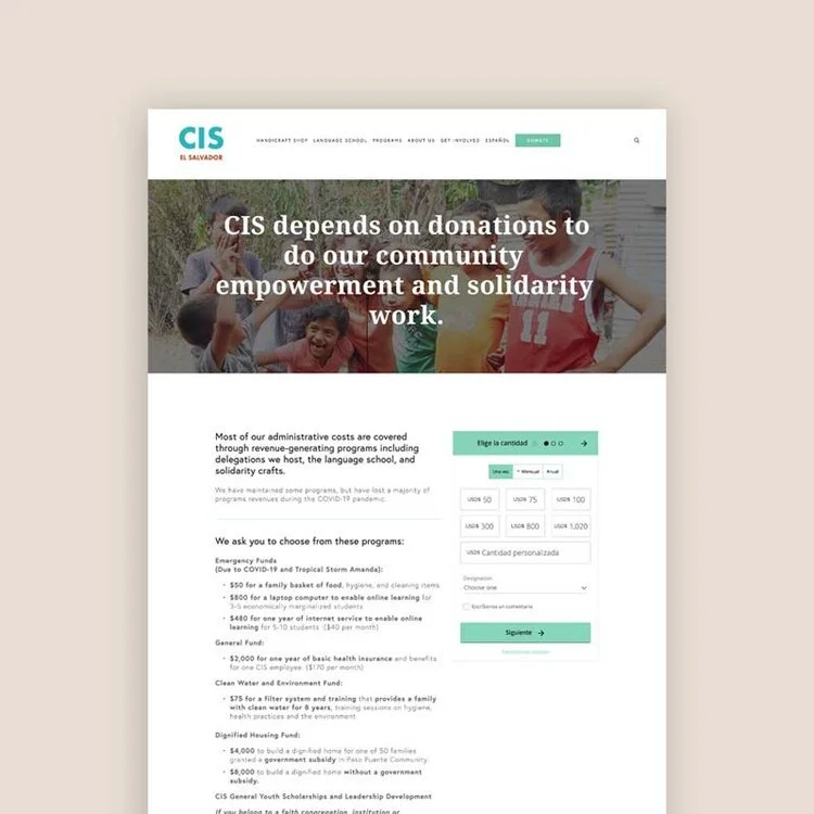
To facilitate donations
Design solutions
The early explorations focused on three main pages: homepage, language school, and programs overview. The CIS has many exciting aspects that need to have their own spotlight, such as the election mission observers, which also has a subpage where the reports of previous elections can be downloaded. The rest of the programs (youth scholarships, dignified housing, clean water, and women entrepreneurship) share the same layout.
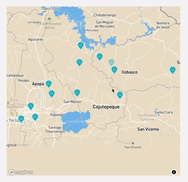
Besides the customized code options for the website, two third-party plugins were used: Donorbox to enable donations and Mapbox to help visualize data on the Clean Water and Environment page. Both plugins use unobtrusive Javascript that is mobile-friendly.
Improving data visualization with Mapbox
The CIS has distributed several water filters and purification units throughout El Salvador. These units enable people to access clean water.
To show the impact of the Clean Water and Environment program, I designed an interactive Mapbox map that shows the key spots where said units were installed instead of displaying a table with the information.
Visual design
Several options for the website layouts and color palettes were tested at the beginning of the project. Unfortunately, the CIS doesn't have an established design style except for the blueish colors that were kept in the redesign.
To simplify and give clarity to users, a simpler version of the logo was made to use on the website. Still, the original logo, widely recognized in El Salvador, will remain the same for merchandising purposes.

Typography
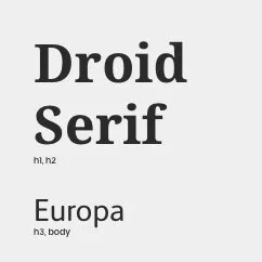
Two font families were chosen for the website, a font pair made of a serif and a sans-serif font to add a layer of elegance while keeping the readability of the paragraphs.
Colors
The final color palette was selected based on a combination of the suggestions by the stakeholders and the colors of the current logo that are widely used in merchandise elements.
Tones and variations of these colors were used throughout the website to emphasize certain elements and separate content on pages with long reads.
Icons
We saw the need to represent complex ideas with icons. The illustration style is simple lines to not compete with the content.
Logo
A simplified version of the logo using Futura was designed to be used as a website logo.
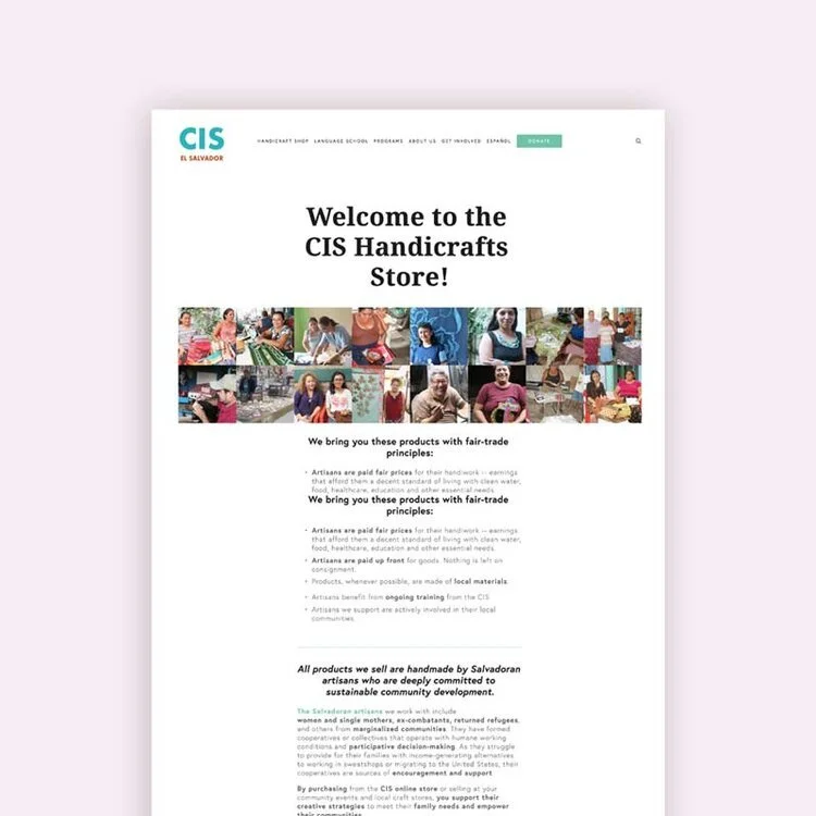
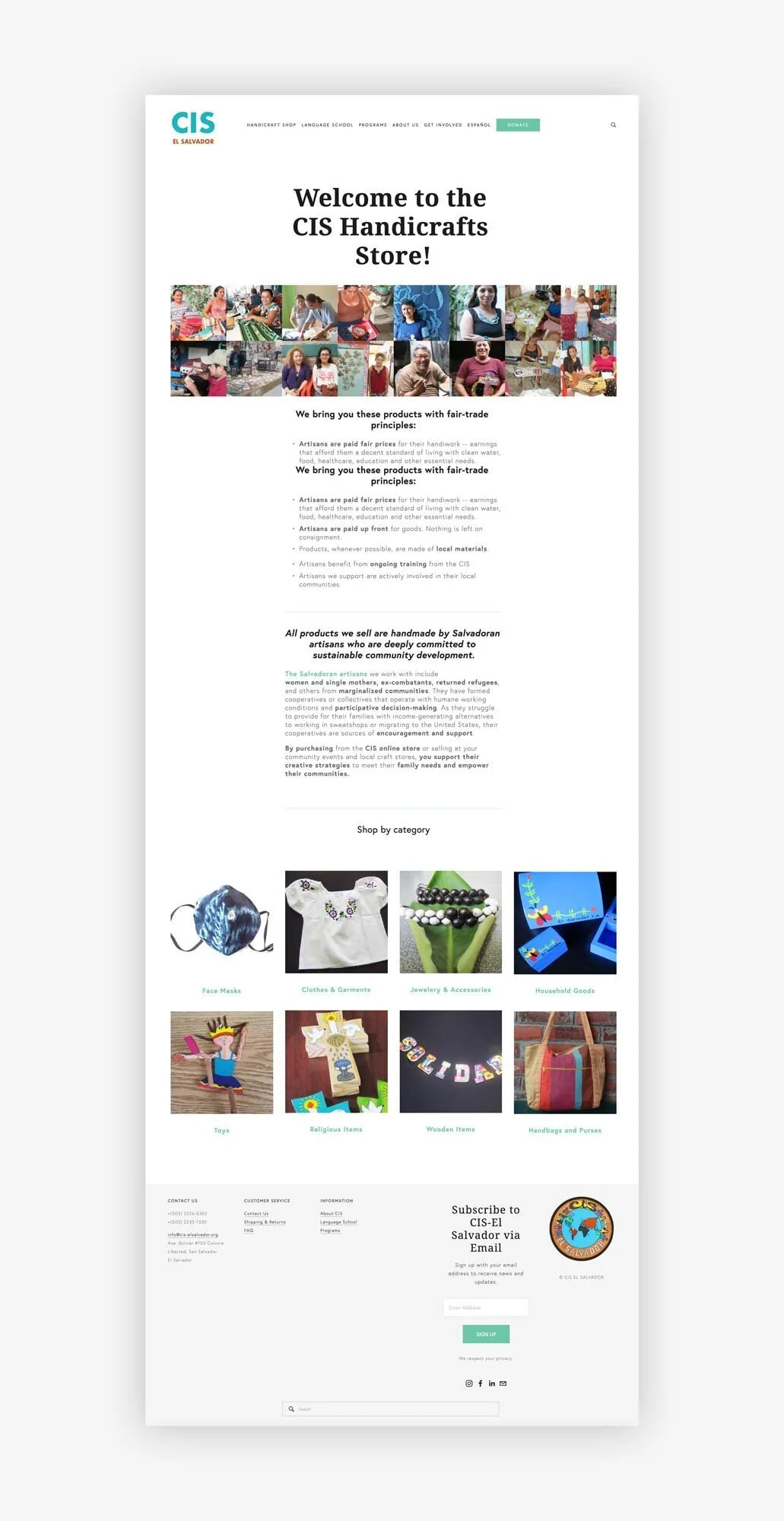
Shop and Blogs
The CIS now has a shop where they sell over 500 products. Squarespace allows shops with up to 200 products, but it is possible to add more by creating separate shops. We did this to be able to feature all the products and made the main page where the products are called via a summary block with categories.
This solution allowed us to give more personality to the shop by adding a block image with the faces of the artisans since the customization options for shops are limited in Squarespace.
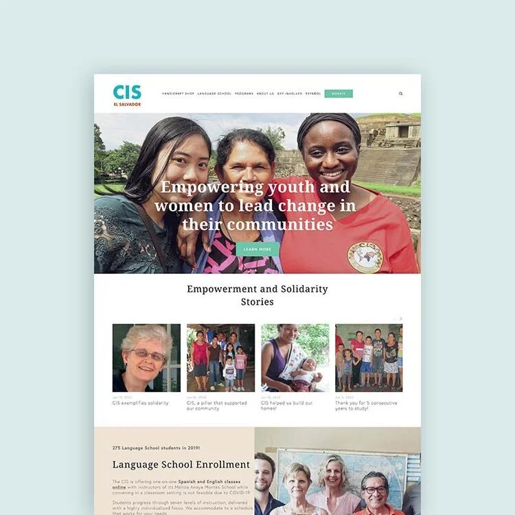
A similar solution was implemented with the blogs: the CIS has two blogs, one for news and another with empowerment stories, which is called to the homepage via a summary block.
Languages
Both versions of the CIS website (English and Spanish) are built within Squarespace and use only CSS to enable two different navigation systems. Except for the shop, all the content has been duplicated and adapted to their Spanish translations.
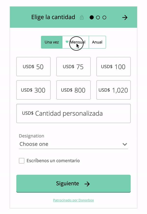
Facilitating donations with Donorbox
Even though Squarespace offers options for donations, we decided to implement a plugin from Donorbox since it is the best platform available, given its affordability and effortless customization.
On top of how user-friendly it is, they also provide a separate landing page hosted on their servers. It benefited us during the domain transfer phase since customers could donate to that platform for the current campaigns.