Adobe Residency Community Fund 2020
The idea for this app was born out of necessity: as a native Spanish speaker, I switch between languages while texting and communicating with clients and colleagues, and so I have encountered difficulties while switching from my native language to a foreign one and in my particular case, English.
This includes the fact that I use apps to improve my writing (even though I've spoken English for years, I can't help but still feel self-conscious about it). This results in sticking to the more accessible communication keyboard, which is usually English. Still, one problem with the English language is that it doesn't have the accents and special characters that Spanish has, making it a unique language, so my Spanish writing is flawed with grammatical errors, all for simplicity.
During my UX classes, an assignment was to design a smartphone app that improves written communication. This was the perfect opportunity to develop my idea: an app that facilitates communication in Spanish.
Language is integral to a person's identity, and we should strive to preserve that beautiful part of our heritage. While developing the idea, I spoke with peers who speak other languages and have to switch to English continually, and surprisingly, they experienced similar problems.
About the Adobe Residency Community Fund
Like many people worldwide, I also saw my livelihood affected by the novel COVID-19. At the moment, I saw many big companies coming up with ideas on how to help their customers and being an Adobe customer since the beginning of my design career, I saw the announcement for the creation of the Community Fund.
Adobe has a fantastic program in which they take interns and pay them a year to develop personal projects. This year, and because of these unique and unexpected circumstances, they created a $ 1 million fund to support artists worldwide. Any person involved in the visual arts and is over 18 years old can participate; the grants go from $500 to $5,000, and it doesn't matter where in the world you are. I encourage you to participate! I applied with my app idea and was lucky to be selected to work on my project.
the problem
the problem
To build an app that improves written communication for bilingual women. I decided to bring my own experiences of being bilingual and working with multi-cultural teams, and having to switch languages while sending messages.
My role
I acted as the "user experience designer." I participated in the entire process, from idea conception to visual design and usability testing.
Interviews
My focus for the interviews was on Spanish-speaking professionals or business owners between 35 and 45 years old. These are the questions:
• Which apps do you use to communicate with people?
• Who do you talk to more often?
• What kind of messages do you write?
• Do you have any problems while writing text messages?
These are the findings from the interviews:
The most used app is Whatsapp, they think it's intuitive, and they like autocorrect
It is used to talk to family, partners, and colleagues
People use the app to say hi to their loved ones and share memes
And these are the pain points:
The app kicks them out
Problems when typing with: space bar, ñ, n, and b
The language button is usually located next to the spacebar, which makes it difficult to access
My user persona:
Susana
Susana is a Spanish-speaking, 43 years-old entrepreneur who started her own business after working many years as a manager for large multinational companies.
She is also a mom and needs constant communication with her small children. Because of her working background and the globalized nature of today's employment, Susana has many contacts that speak other languages, mainly English.
Susana enjoys her new venture and constantly communicates with her children while attending her business, where she speaks English daily. Susana considers herself a "tech-wiz" and an early adopter. She also prefers to text instead of calling.
The importance of interviews
I designed the app's first version after the above set of interviews and the creation of Susana, my user persona. I then conducted usability tests and realized my design needed improvement: some interviewees didn't know what to do with the app.
Here's where I followed the advice from my Adobe mentoring sessions and created onboarding screens.
Additionally, because I tested extreme users, I decided to create two new personas since their feedback was remarkable.
Based on that feedback, I made these changes:
Created two additional personas based on extreme users
Refined the prototype to include extra screens with more accurate feedback and instructions
Designed 2-3 onboarding screens
Design and test a set of icons to clarify specific functions of the app
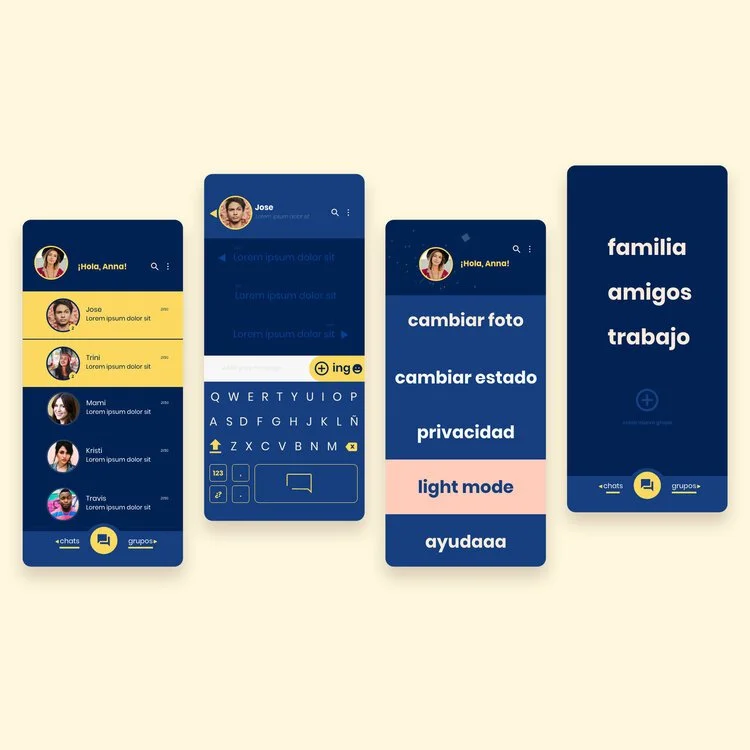
Created a dark theme featuring a high-contrast color palette.
Extreme users
Extreme users are people who are not the intended user of a product. This doesn't mean they should be excluded; quite the opposite: insights from extreme users usually better the user experience.
Sofia is a 22 years-old university student. She considers herself an "old soul" and says she doesn't understand technology; however, she enjoys apps like Tik-Tok and Snapchat. She rarely makes phone calls and prefers to send texts or voice clips. Sofia is aware of technology, but her generation grew up with it, so it's part of her day-to-day.
Alfonso retired recently. He's 65 years old and spends his days reading and watching documentaries. He's up to date with the most recent gadgets and has no trouble adapting to new technologies. Alfonso communicates mainly with his family and likes to send memes. He doesn't enjoy texting and prefers to call; his smartphone is more of a past-time gadget.
Design solutions
I started by exploring the 2 apps most often used by my users, Whatsapp and Facebook. I struggled to find where to improve, as, in my opinion, they have fantastic usability. So my biggest issue was the keyboard.
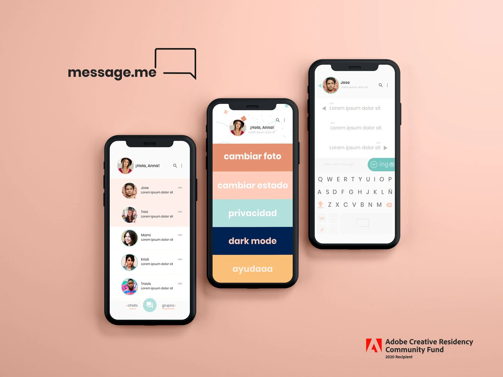
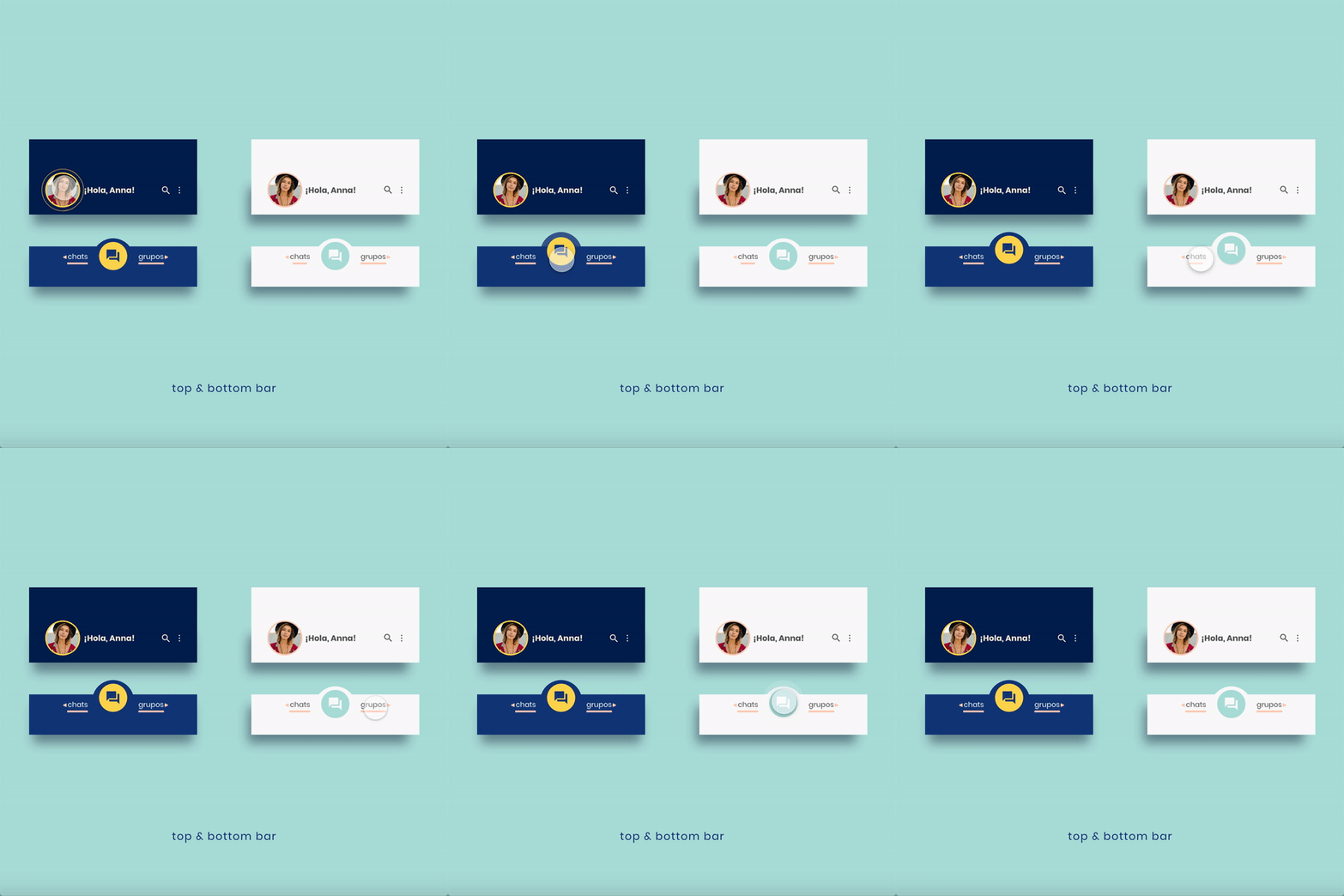
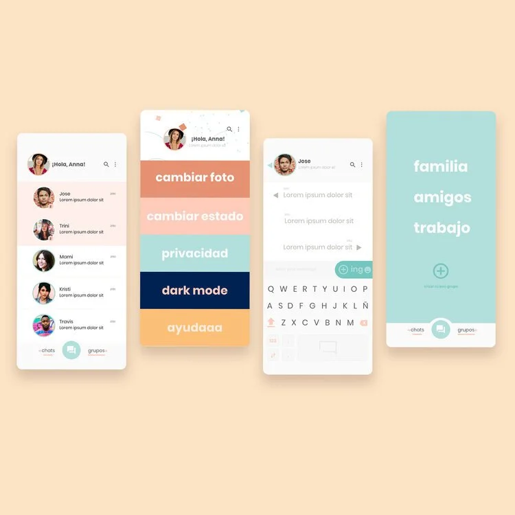
My solution is a concentrated version of WhatsApp and FB Messenger. It doesn't have the "stories" feature. It has two separate tabs, one for individual chats and one for groups. On the groups tab, the groups can be called, video-called, and message; I'm using only icons to communicate these ideas.
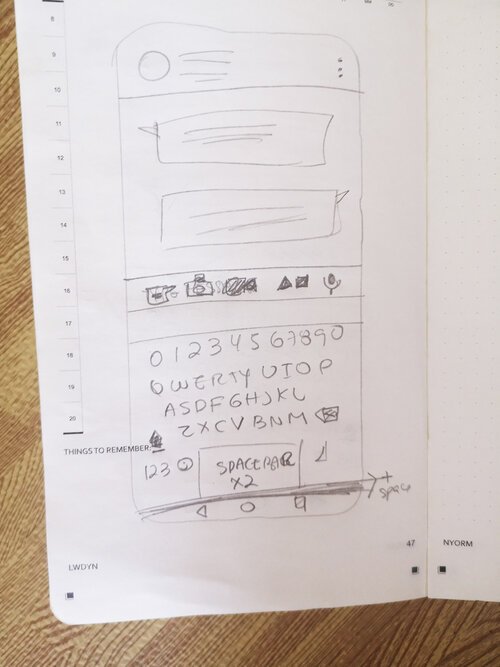
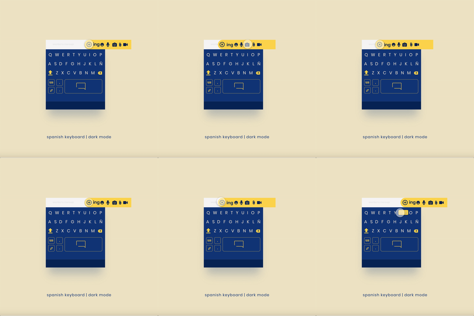
The keyboard is the traditional QWERTY keyboard; as I read before, one doesn't have to reinvent the wheel, just improve it. The most notorious change is the space bar, double the standard size. There is also a separation between the space bar and the home button to avoid the issue of people accidentally pressing it, therefore returning to the home screen.
The keyboard is optimized for the Spanish language, and following best usability practices, I moved the main menu to the bottom, so it is easier to find.
Version2 includes onboarding screens that briefly explain how to use the app.
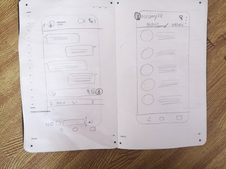
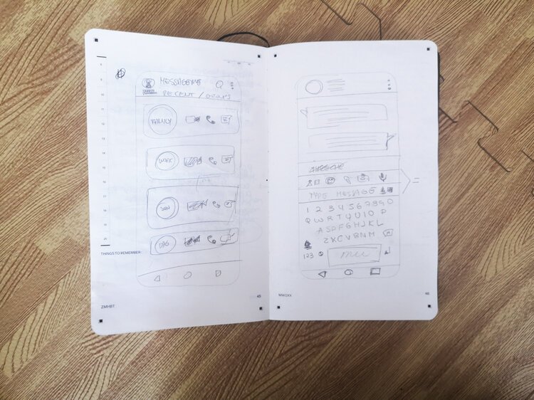
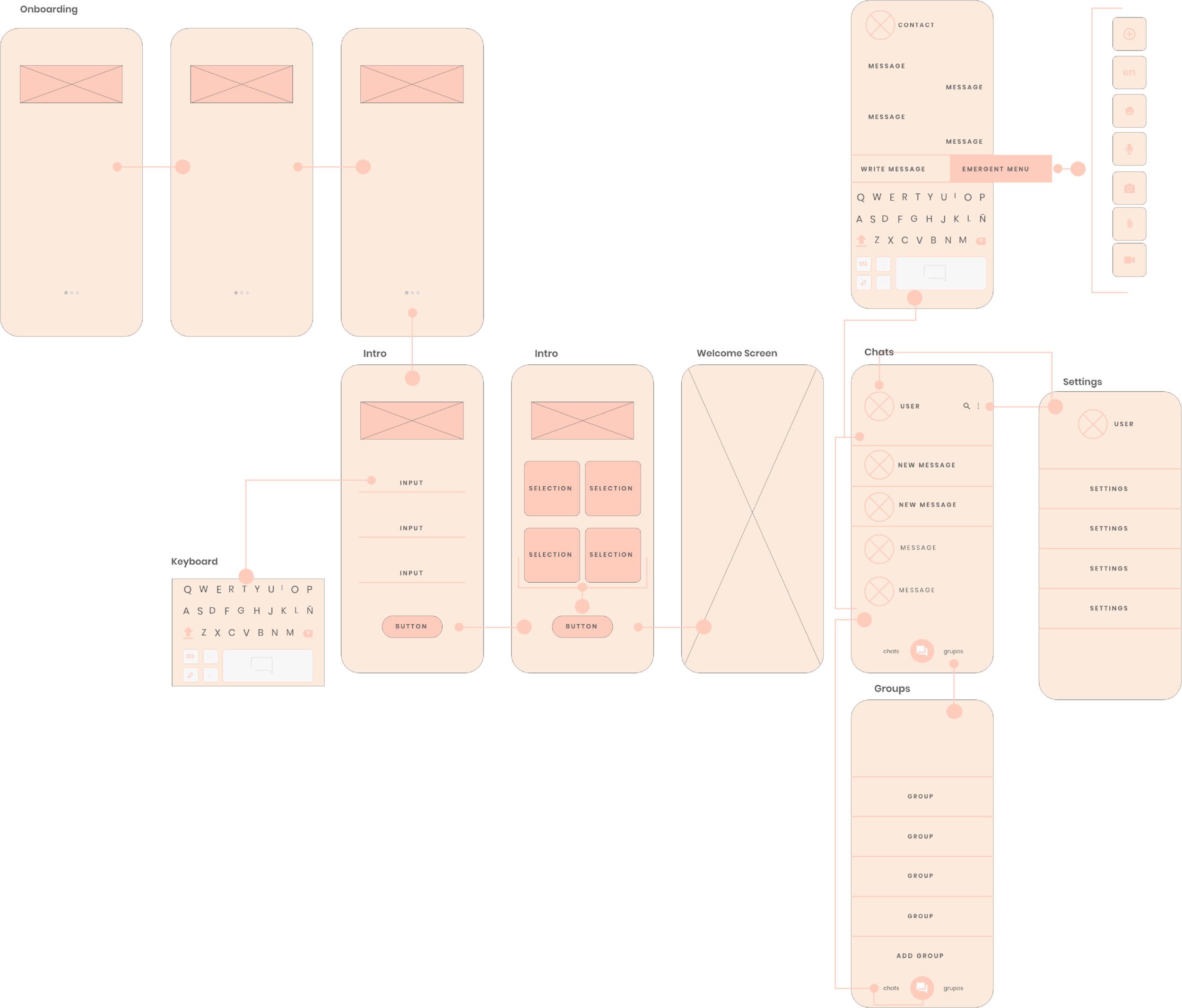
I start by sketching and then proceed to the wireframes. I like to use wireframes for three main reasons:
Allows me to layout key pages
Helps me understand the user journey in a visual manner
It can be used for early usability tests.
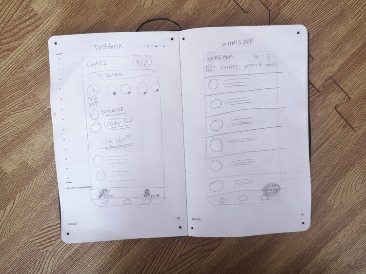
For this project, I started with paper prototypes that I used to study the significant messaging platforms available: Facebook Messenger and WhatsApp, which were the apps my users preferred.
The keyboard
The keyboard was the one feature I wanted to redesign because, to this day, I haven't found a keyboard that is not messy to use. During the usability tests, I noticed people pressing the home button continuously. Still, they are so used to doing that that sometimes it goes unnoticed until the annoyance is too big and can't be ignored. As I voiced my concerns to some peers in the past, they commented they also face the same problems, and it's prevalent with people who speak more than one language daily. This happens because keyboards are made for "everybody." But not everybody is the same, and not everybody faces the same issues. One of my purposes for doing this is to encourage people to use their native language confidently and use all the special characters that make each language unique.
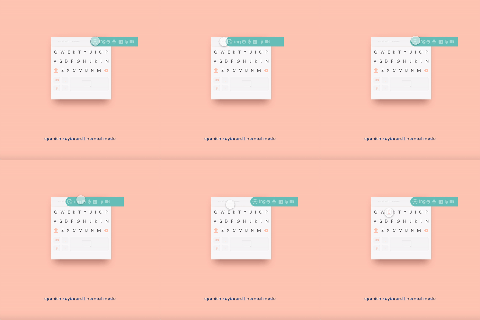
I've also unified an emergent menu to the side of the texting area, as I think there is no need to have two buttons to call emojis, and removed the enter key as it appears by default while writing a message in the texting area. This change allowed me to increase the size of the spacebar, and by separating the other functions from the bottom (where they are easily accessible), making mistakes less likely to happen.
Visual design
After the usability testing, I realized the app needed improvement in its experience and visual design. I was very motivated to create a "companion" for the users; therefore, lacking capitalized words (except on the keyboard) and using a language that brings familiarity is very important. I decided to stay with the palette I chose previously but added a more extensive range of colors and created a dark theme. The colors continue to be soft but playful while catering to people who like darker colors or use them for reading at night.
The font I chose is Poppins for its clarity and geometric softness. In future versions, I'd like to include suggestions from the usability test results, including another dark mode that is not contrasting (i.e., Twitter) and a color-blind mode.
Fonts
Logo
The screens
Onboarding screens
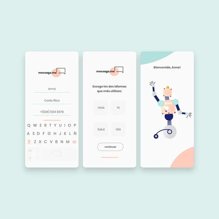
I included 4 onboarding screens to briefly explain the app and what can be done with it.
After the initial introduction, the user can add their name, country, and phone number (the area code will appear after selecting the country). I decided to use typing instead of dropdowns or similar. The keyboard will be triggered when the typing space is activated. There is no need to open accounts as the information will be validated against the cellphone number (similar to WhatsApp). Since the purpose is to simplify the keyboard and minimize errors, only two languages can be selected.
Messaging and Settings
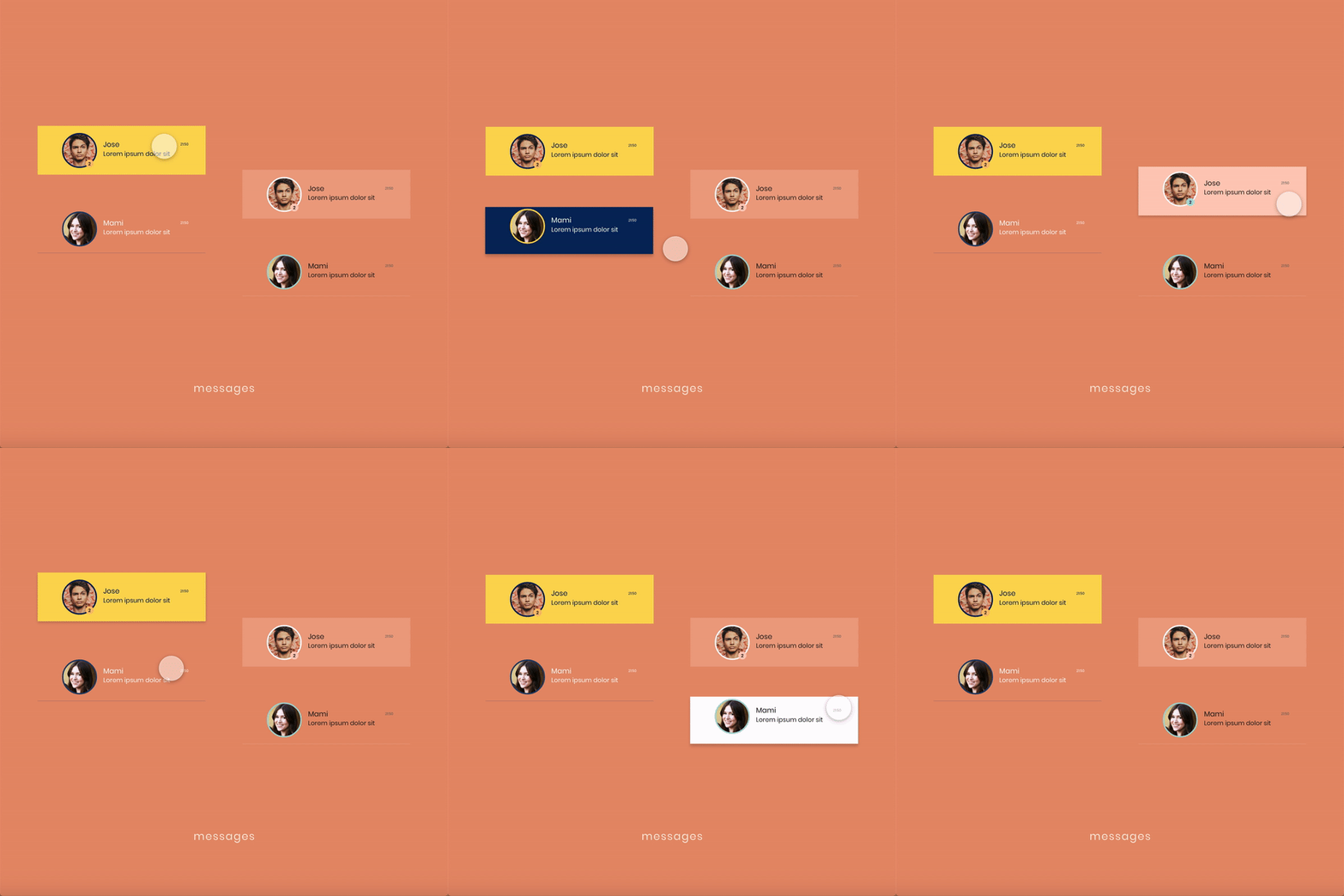
The main functions are located at the bottom to access quickly. New messages are highlighted are the top of the main screen. The secondary palette is used for the settings. The overall design is simple and straightforward, with big letters and lots of space to move around.
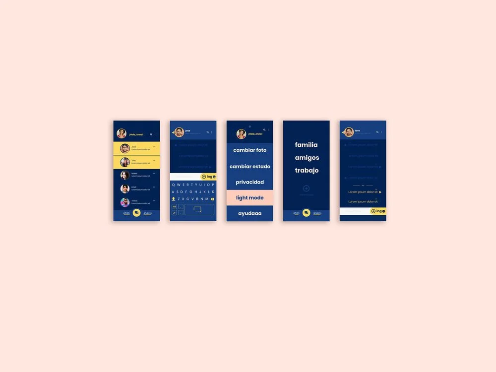
Dark Mode
Since the dark mode is only accessible through the settings, it only needs the four main screens.


Conclusion
This project has been an invaluable experience for me. Not only did I get the opportunity to work on a project that is entirely mine, but I also worked as a UX designer and got to dive deep into one of my favorite tools, AdobeXD.
My purpose is to make people's lives easier while also making them feel represented and keeping alive that significant part of our identity that is our language.
